Overview
My Role(s)
User Research
Ideation
High-Fidelity
UX/UI Design
Style Guide
Timeline
September 2022 - Dec 2022 (13 Weeks)
Team Size
4
Background
This is a project developed in my Human-Computer Interaction course. Students will work as a team to carry on a final project that may involve interactions with stakeholders, developing a working prototype, and evaluating it through deployment.
Problem
Travelers and language learners alike have difficulty reading, writing, and communicating effectively with those in a different language from them.
When one is traveling to another country, there are many signs and paperwork in airports, restaurants, attractions, and more than one might not know how to read. Additionally, reading is only half the battle, as one would also need to speak the language of the country they’re in to communicate.
Solution
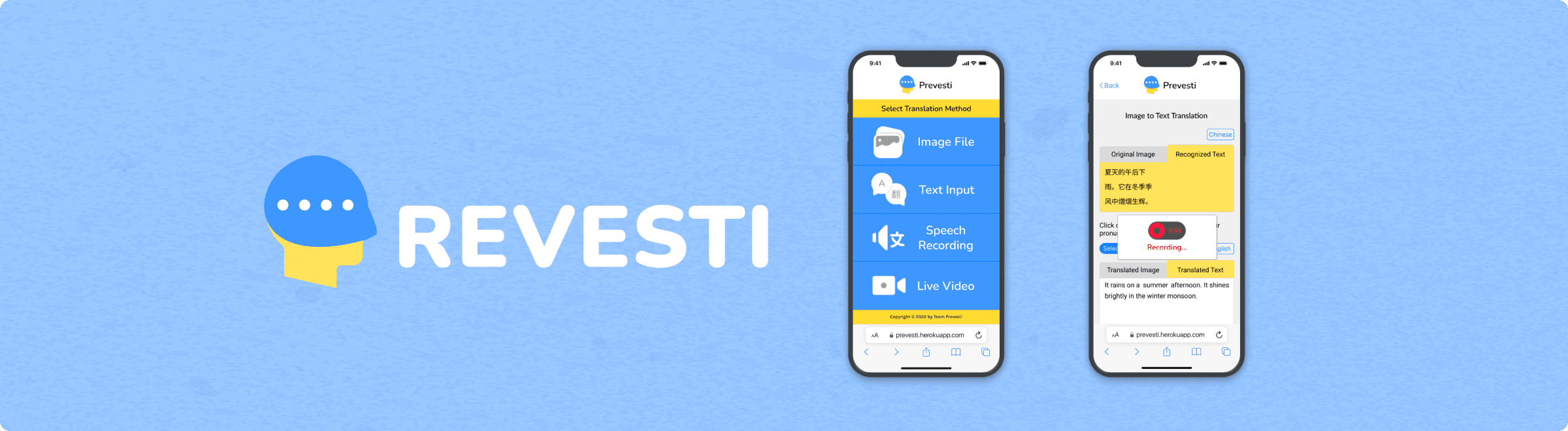
A web app that offers translation tools to help travelers not only learn to read an unfamiliar language, but communicate effectively as well.
To tackle this problem, we wanted to create a web app that could be accessed from any modern device, so long as it has an internet/data connection. Through this, it doesn't matter which country the traveler is currently in, they could easily go to our site without an issue.
Being able to read a newer language will help travelers identify certain locations. However, the pronunciation of a word or phrase is fundamental to communicating with others and getting by. Our product hopes to hone in on these two ideas such that its users can be well instructed and increase their confidence levels in another language.
Research
We started with a survey as a way to get a lot of feedback and feedback quickly.
Survey
MOST participants liked that Google Translate is easily accessible, but disliked that it was inaccurate with long sentences.
When developing our survey, we kept the questions straight-forward and close-ended for the most part, as it will make analyzing a large set of respondents smoother. These respondents are international travelers, and that allowed us to widen our search outside our campus. We began with general background questions regarding race/ethnicity and languages spoken. Nearing the end of our survey, we asked questions regarding one of our competitors, Google Translate. Here are our some of our main questions we asked our participants:
Have you traveled to a country where their primary language is not your native language?
What languages do you speak? Check all that apply.
Were there times that you doubted your pronunciation in a foreign language?
What do you like about Google Translate?
What are some features you think Google Translate lacks?
Survey Results & Insights
Here are the major insights from what we gathered in our survey:
Quantitative:
34/36 participants are bilingual, where English was the primary language known
30/36 participants have traveled to a country where they were not fluent in their dominant language
26/36 had trouble reading documents abroad in a foreign language
Qualitative:
Participants like that Google Translate is easily accessible, straightforward, and accurate with small phrases.
Participants dislike that Google Translate is inaccurate with long sentences and lack context detection.
User Interviews
For our user interviews, we wanted targeted college students that are from different country where English is not the dominant language. We interviewed 4 different international students; 2 of these students traveled to the US for college, while the other 2 came to America before college. One of our research objectives was to learn about user experiences with existing translation products and the context behind their usage.
Our other objective was to discover ways our product can aid language learning based on participants’ experiences. I conducted 3 of our 4 interviews. And going in, the key questions we had were:
How have users engaged with previous apps of similar functionality?
What are the biggest pain points when using language translation software?
What has helped people learn languages quickly in their past experiences?
User Interview Analysis
User Insights
Translation tends to be formal in softwares like Google Translate
Image translation make the learning experience more seamless and convenient
Speaking with others of a language that is being learned is a good way to improve pronunciation
Current apps do not clearly distinguish sentence and word translation
User Needs
Have less formal translation
Clear image to text and live feedback translations
Provide pronunciation feedback to practice
Show how a phrase or word is used in sentences and by itself
Affinity Diagram

Prototyping
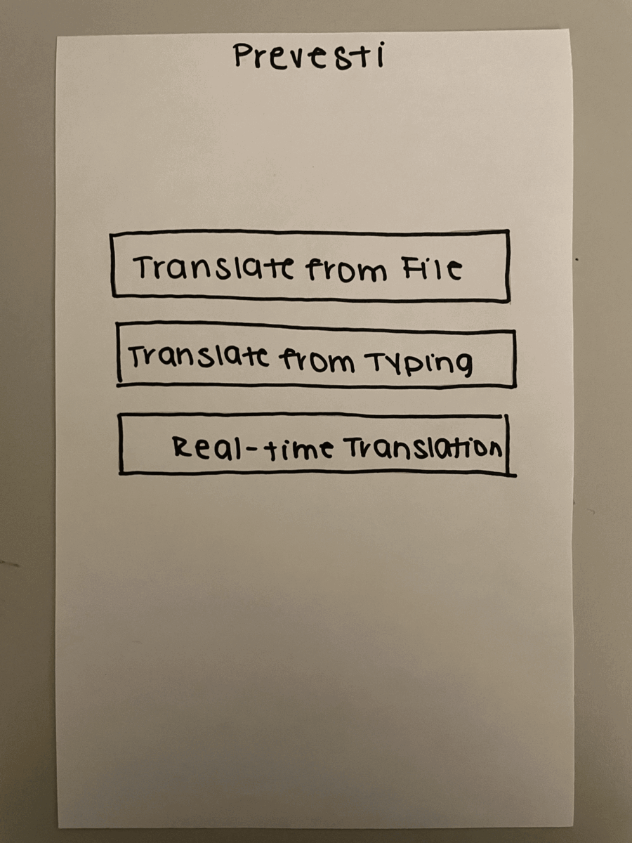
Low-Fidelity (Paper Prototype)
The goal of our product involves equipping travelers and language learners with translation tools, in-hand, for them to navigate unfamiliar spaces and speak to a wider set of people. As such, we designed this prototype to have a mobile view.
We chose to do paper prototyping as we wanted to quickly get feedback on our ideas while focusing on the right thing before more complicated iterations.
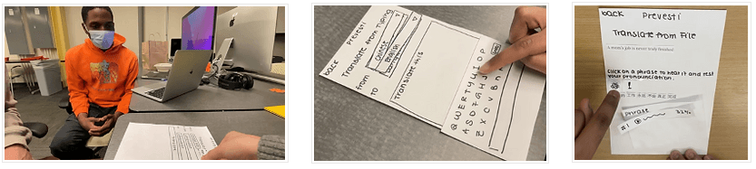
Usability Test
For the paper prototype, I acted as the facilitator guiding real users to complete a task using the paper prototype. And one of my teammates acted as the "human computer" where they would manipulate the paper prototype and mimic the system of our product. This task required the users to translate a document from Chinese (Mandarin) to English, then for them to practice learning and pronouncing a document phrase. This phrase could be broken up by word or stay in its entirety. Users had the option of recording their pronunciation to be rated in terms of accuracy along with hearing how it is supposed to be said in its native language.
User Insights & Observations
Users were confused about which parts were clickable for them to have pronounced, including how to hear the entire phrase
There was no visual distinction between how translation changes in a sentence versus by word
Page headings could be more consistent
Icons were unclear
Mid-Fidelity Prototype
Afterward, we dove into creating the mid-fidelity prototype on Figma!

Style Guide
Then, I got to work on making the styles for a high-fidelity prototype.

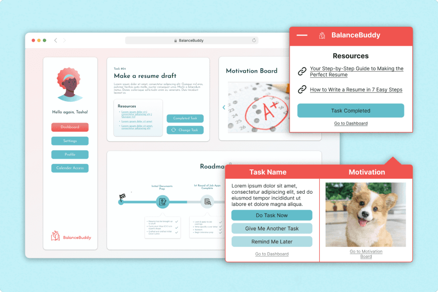
High-Fidelity Prototype (Clickable)
For our high-fidelity prototype, I made sure to incorporate feedback from previous usability testing and used our mid-fidelity as a basis for design.
Implementation
Created a full-featured working prototype!
Due to time constraints, we were not able to fully match the working prototype to reflect what could be observed in our high-fidelity prototype. However, we made sure to sustain most of the fundamental parts of our design along with including all of our features.
Developmental Environment
Front-end: HTML/CSS
Web Framework: Flask
OCR Model: Google Python Tesseract (OCR Engine Pytesseract)
Back-end: Python
Version Control: Google Drive
API: Google Translate

Evaluation
Lastly, we wrapped up our project by evaluating our working prototype to see what things could be further improved. We chose to do a between-subject study design, and had the experimental and control groups (5 participants per group) complete a set of two different tasks respectively.
Experimental Group
Task 1:
Translate some French text using Prevesti and complete a reading comprehension quiz
Task 2:
Learn to pronounce French words while receiving feedback on pronunciation
Control Group
Task 1:
Translate some French text using Google Translate and complete a reading comprehension quiz the text.
Task 2:
Learn to pronounce French words without receiving feedback on pronunciation.
User Insights
Experimental Group
Average score of 92% on reading comprehension quiz
Average score of 80.3% on pronunciation
Control Group
Average score of 92% on reading comprehension quiz
Average score of 72.12% on pronunciation
Other Major Insights
Translations were displayed inefficiently
Took a lot of scrolling to get to the bottom of the page and the user felt overwhelmed as a result
Participants were confused about which page they were on as the "head icon" did not provide enough info
The meaning of "Line-by-Line" translation was unclear
Reflection
I had a really fun time working on this project! One of the major things I took on doing the high-fidelity prototype and I devoted a ton of time and patience to flesh it out. It was a huge challenge for me to figure out an effective and efficient way to organize so much information. And on top of that, I had to make certain design choices that were entirely removed from the previous prototypes. That allowed me to not be so reliant and strict in following what came before. Moreover, it gave me a chance to create something entirely new that would have been ideally tested.
Not everything will go to plan: When starting Prevesti, we knew it would take a lot of time for the working prototype to reach a point ready to show off. The back-end was something that our developers thought about in advance, as they would have to gauge their schedule and capabilities. So once we had an idea of what features we wanted to include, the process for the back-end started to take off. That being said, time constraints held us back from evaluating our prototypes as thoroughly as we would have liked.
More Testing: Due to our strict timeline, we prioritized testing our low-fidelity prototype—to find possible issues early on—and our working prototype, as that is our final product. Also, the fundamentals of our design remained throughout the prototypes leading up to our working prototype. That being said, more testing would have allowed us to prevent the issues we had with our working prototype; testing leads to better iterations.
Teamwork was a struggle: I think it is important to get close to teammates so they feel good about communicating openly and honestly if things about their responsibilities. Also, our developers ignored certain design features that were crucial to the user experience and this was highlighted a bit in our user evaluations. Next time, I would further clarify my justifications for certain features as well as let one of the developers take notes during the user evaluations for them to hear why these changes are important.
Other Projects