Overview
My Role(s)
User Research
Ideation
Prototyping
Front-end Development (Dashboard)
Timeline
February 2022 - April 2022 (13 Weeks)
Team Size
3
Background
This project was created as part of my course in Introduction to Human-Computer Interaction, where students form a team to develop a working application that addresses a real-world problem through user-centered research and design methods.
Problem
College students struggle to balance their schoolwork while committing to the application process for jobs/internships
As college students ourselves, we’ve experience and noticed how our peers have had difficulties managing our time effectively during the academic year to complete the process for jobs/internships. We defined the job “application process” as the entire journey, from start to end, until students respond to employment offers. This journey may include document preparation (resume, cover letter, LinkedIn), searching for job postings, and completing interviews, among other things.
The challenge for students to fulfill the job application process can be attributed to a few things. For one, students prioritize their academic goals, which consequently result in less time and energy to devote to the job application process. And ultimately, securing a job offer. With those things in mind, students tend to lose motivation during the job application process, especially if the are unfamiliar with it. Students new to the process can feel lost on what steps they need to take to get started, or at the very least may not be sure on how to complete said steps.
Solution
A web browser extension that encourages and notifies students daily to complete curated job-related tasks based on their schedule
So, why a browser extension or an app? Well, we wanted our product to be something that can be used daily. As such, we wanted to integrate ourselves into a place where students consistently access and a place where students go to apply for jobs. An extension seemed like the best option, as it fits that criteria.
Research
To kick off our research, we first did a bit of competitor analysis to see if there were a service or app that resolved a problem such as ours.
Existing Solutions
Guide users on getting a job
Motivate users to follow through with job applications
Generate curated tasks based on user needs
Help users balance their schoolwork
We found two applications, Huntr and Google Calendar, that only offer a partial solution to the problem.
User Insights
Translation tends to be formal in softwares like Google Translate
Image translation make the learning experience more seamless and convenient
Speaking with others of a language that is being learned is a good way to improve pronunciation
Current apps do not clearly distinguish sentence and word translation
User Needs
Have less formal translation
Clear image to text and live feedback translations
Provide pronunciation feedback to practice
Show how a phrase or word is used in sentences and by itself
Affinity Diagram

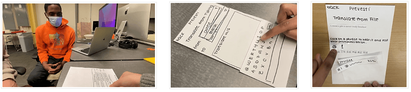
Prototyping
User flows + Tasks
3 key user flows made from use cases that highlight human-computer interactivity
When thinking of what major use cases best showcase how BalanceBudddy would be used, we identified 3 that we could then develop into features. Moreover, the steps (or tasks) involved, and the progression of said steps with regard to our user and our product.
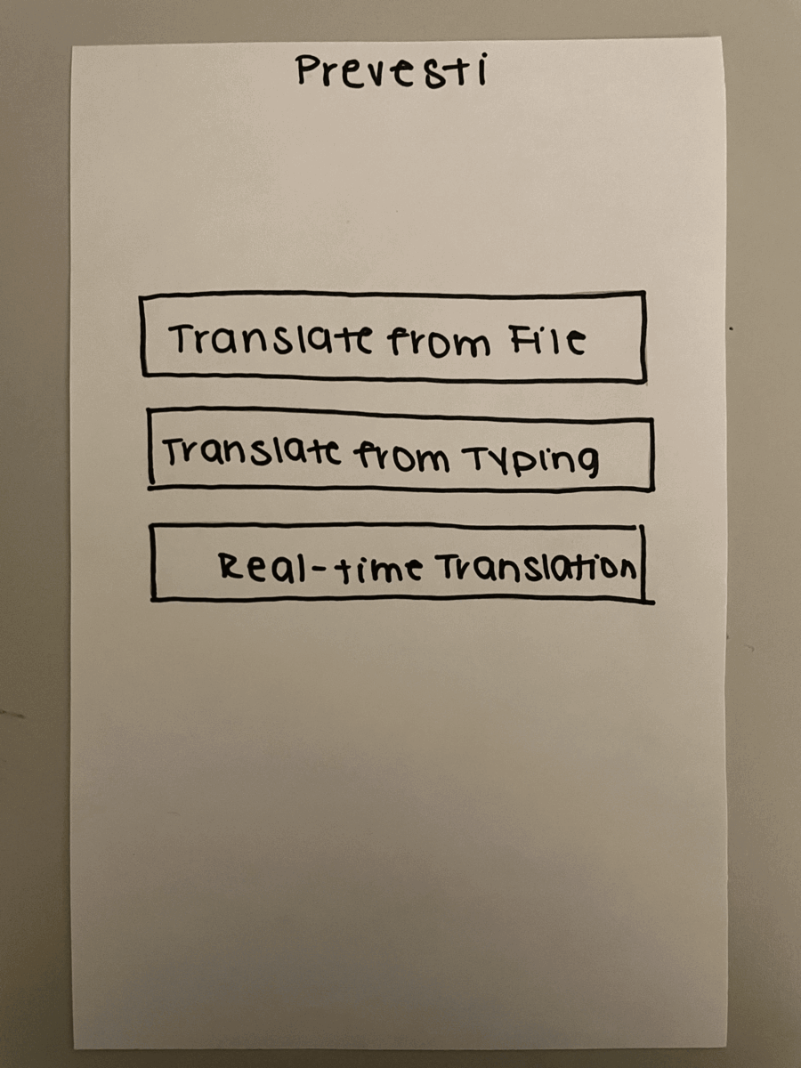
Mid-Fidelity Prototype
Afterward, we dove into creating the mid-fidelity prototype on Figma!

Style Guide

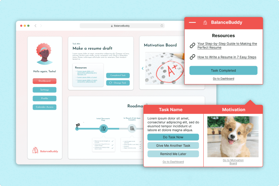
High-Fidelity Prototype (Clickable)
For our high-fidelity prototype, I made sure to incorporate feedback from previous usability testing and used our mid-fidelity as a basis for design.
Implementation
Created a full-featured working prototype!
Due to time constraints, we were not able to fully match the working prototype to reflect what could be observed in our high-fidelity prototype. However, we made sure to sustain most of the fundamental parts of our design along with including all of our features.
Developmental Environment
Front-end: HTML/CSS
Web Framework: Flask
OCR Model: Google Python Tesseract (OCR Engine Pytesseract)
Back-end: Python
Version Control: Google Drive
API: Google Translate

Evaluation
Lastly, we wrapped up our project by evaluating our working prototype to see what things could be further improved. We chose to do a between-subject study design, and had the experimental and control groups (5 participants per group) complete a set of two different tasks respectively.
Experimental Group
Task 1:
Translate some French text using Prevesti and complete a reading comprehension quiz
Task 2:
Learn to pronounce French words while receiving feedback on pronunciation
Control Group
Task 1:
Translate some French text using Google Translate and complete a reading comprehension quiz the text.
Task 2:
Learn to pronounce French words without receiving feedback on pronunciation.
User Insights
Experimental Group
Average score of 92% on reading comprehension quiz
Average score of 80.3% on pronunciation
Control Group
Average score of 92% on reading comprehension quiz
Average score of 72.12% on pronunciation
Other Major Insights
Translations were displayed inefficiently
Took a lot of scrolling to get to the bottom of the page and the user felt overwhelmed as a result
Participants were confused about which page they were on as the "head icon" did not provide enough info
The meaning of "Line-by-Line" translation was unclear
Reflection
I had a really fun time working on this project! One of the major things I took on doing the high-fidelity prototype and I devoted a ton of time and patience to flesh it out. It was a huge challenge for me to figure out an effective and efficient way to organize so much information. And on top of that, I had to make certain design choices that were entirely removed from the previous prototypes. That allowed me to not be so reliant and strict in following what came before. Moreover, it gave me a chance to create something entirely new that would have been ideally tested.
Not everything will go to plan: When starting Prevesti, we knew it would take a lot of time for the working prototype to reach a point ready to show off. The back-end was something that our developers thought about in advance, as they would have to gauge their schedule and capabilities. So once we had an idea of what features we wanted to include, the process for the back-end started to take off. That being said, time constraints held us back from evaluating our prototypes as thoroughly as we would have liked.
More Testing: Due to our strict timeline, we prioritized testing our low-fidelity prototype—to find possible issues early on—and our working prototype, as that is our final product. Also, the fundamentals of our design remained throughout the prototypes leading up to our working prototype. That being said, more testing would have allowed us to prevent the issues we had with our working prototype; testing leads to better iterations.
Teamwork was a struggle: I think it is important to get close to teammates so they feel good about communicating openly and honestly if things about their responsibilities. Also, our developers ignored certain design features that were crucial to the user experience and this was highlighted a bit in our user evaluations. Next time, I would further clarify my justifications for certain features as well as let one of the developers take notes during the user evaluations for them to hear why these changes are important.
Other Projects